
We’ve all been there: You click on a promising link, only to find a website that looks like it’s been run over by a digital truck when viewed on your phone. You pinch, zoom, and squint—but nothing helps. Frustrating, right? Now imagine your readers feeling the same way about your site. Cue dramatic music. Mobile responsiveness isn’t just a fancy term to impress your developer friends. It’s a non-negotiable aspect of modern SEO. If your website isn’t mobile-friendly, you’re essentially telling Google, “Eh, I’m not really interested in ranking well.” So let’s dive into why mobile responsiveness is critical for SEO success—and have a little fun while we’re at it.
What Is Mobile Responsiveness?
Simply put, mobile responsiveness means your website looks and functions just as beautifully on a smartphone or tablet as it does on a desktop.

It’s like being a great host at a party—whether your guests show up in sneakers or stilettos, they’ll feel welcome.
Why Mobile responsiveness is critical for SEO success?
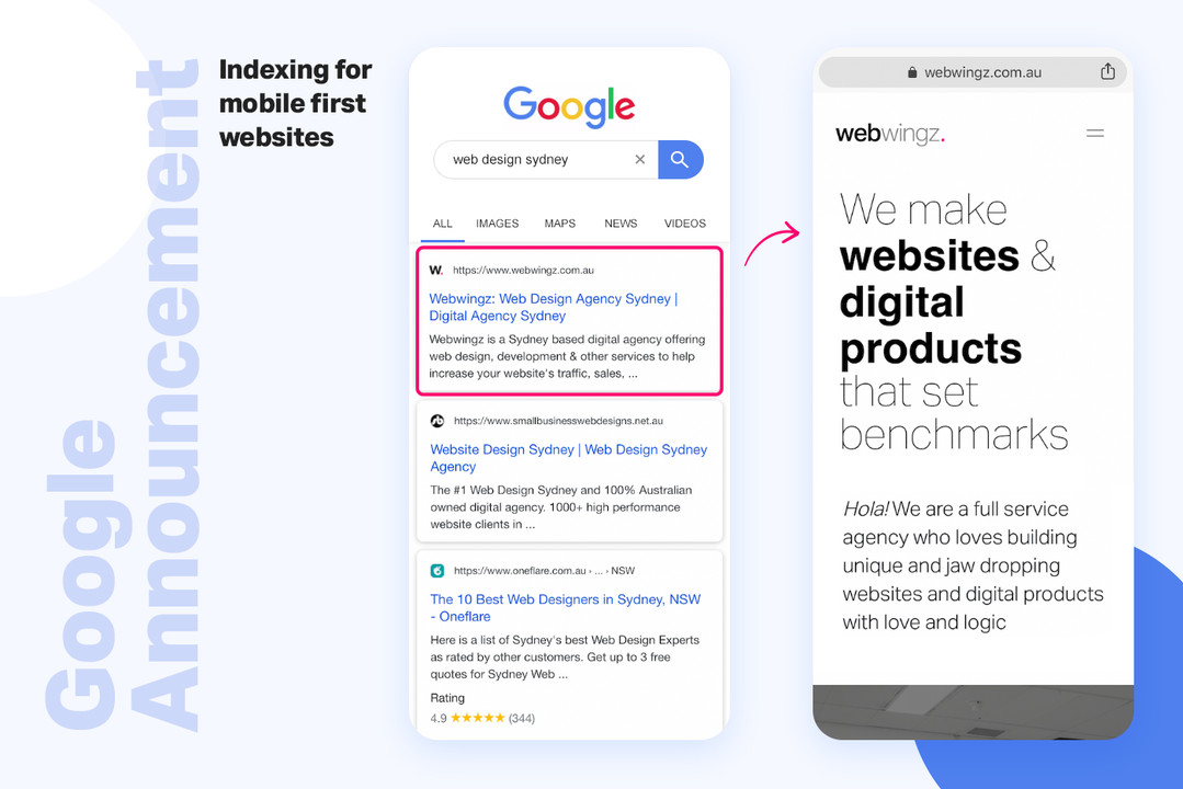
- Google’s Mobile-First Indexing
In 2019, Google decided to prioritize mobile versions of websites for indexing and ranking. In plain English: If your site isn’t mobile-friendly, Google might swipe left on you.
- Improved User Experience
Nobody likes a clunky website. Mobile responsiveness ensures your visitors can navigate easily, read your content, and complete actions (like buying that fancy blender) without breaking a sweat.

- Lower Bounce Rates
When users encounter a poorly optimized site, they bounce faster than a kid on a trampoline. High bounce rates signal to Google that your site isn’t providing value, which can hurt your rankings.
- Increased Conversions
A seamless mobile experience can be the difference between a visitor adding items to their cart or abandoning ship. Responsive design keeps them engaged and ready to convert.
How to Check if Your Site Is Mobile-Friendly
- Google’s Mobile-Friendly Test
Type your URL into Google’s Mobile-Friendly Test tool, and it’ll tell you whether your site passes the test. Bonus: It’ll even give you suggestions for improvement.
- Manual Testing
Whip out your smartphone and navigate through your site. Does it load quickly? Are the fonts readable? Can you click buttons without accidentally opening 10 tabs? If yes, you’re on the right track.
- Analytics Insights
Tools like Google Analytics can show you how mobile users interact with your site. High mobile bounce rates? Time to investigate.
Best Practices for Mobile Responsiveness
- Use Responsive Design
Responsive design ensures your site adapts to different screen sizes. It’s like having a wardrobe that fits perfectly, whether you’re heading to a yoga class or a black-tie event.
- Optimize Images
Large images can slow down your site’s loading speed. Compress them without sacrificing quality using tools like TinyPNG or ImageOptim.
- Prioritize Speed
Mobile users are impatient. If your site takes longer than three seconds to load, they’ll likely bail. Use tools like PageSpeed Insights to identify and fix speed issues.
- Simplify Navigation
Ditch the clutter. Keep your menus simple and ensure buttons are easy to tap. Remember, mobile users don’t have the luxury of a mouse.
- Avoid Flash and Pop-Ups
Flash doesn’t work on most mobile devices, and intrusive pop-ups can drive users away. Instead, focus on creating clean, user-friendly designs.
Common Mistakes to Avoid
- Tiny Fonts
Nobody wants to squint to read your content. Use legible font sizes and ensure there’s enough spacing between lines.
- Ignoring Touchscreen Behavior
Make buttons large enough to tap comfortably. Nobody likes accidentally clicking the wrong link because your button’s the size of a grain of rice.
- Neglecting Mobile Testing
Assuming your site works on mobile without testing is a rookie mistake. Regularly check how your site performs on different devices.
How Mobile Responsiveness Boosts SEO
- Higher Rankings
Google loves mobile-friendly sites. The more optimized your site is, the better your chances of climbing the SERPs.
- Better Local SEO
Mobile searches often have local intent (e.g., “pizza near me”). A responsive site ensures you’re ready to capture those hungry customers.
- Improved Social Sharing
Most social media browsing happens on mobile. A responsive site makes it easy for users to share your content, increasing your reach and visibility.
Final Thoughts: Mobile Responsiveness Is Non-Negotiable
In today’s digital landscape, mobile responsiveness isn’t optional—it’s essential. By optimizing your site for mobile users, you’ll improve user experience, boost your SEO, and ultimately drive more conversions.
So don’t wait until your bounce rates skyrocket or Google gives you the cold shoulder. Start prioritizing mobile responsiveness today. Your users (and your rankings) will thank you.
Did I miss anything.?
Let me know in the comment section
If you also enjoyed reading this, check out other latest posts on SSL, website and tech related.