
Okay, picture this: You’ve just spent hours crafting the perfect landing page. It’s sleek, it’s compelling, it’s got all the right calls to action… but wait—what happens when someone views it on their phone? Suddenly, the images are warped, the text is unreadable, and your CTA button is buried under a mountain of confusion. That my friend is a state of anti mobile-responsive .

If your landing page isn’t mobile-responsive, you might as well be throwing your marketing budget out the window.
In 2024, mobile-first design isn’t just a trend—it’s a must. So, how do you craft a landing page that looks amazing on any device, from desktop to smartphone?
Buckle up, because we’re diving into the art of designing a mobile-responsive landing page.
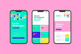
Step 1: Start with the Right Layout
First things first—keep it simple. On a mobile device, less is definitely more. Your goal? Make sure that key content (like your headline, value proposition, and CTA) is front and center. Think of your landing page as an elevator pitch—it needs to grab attention fast.
Use a single-column layout for mobile—this ensures that everything stacks vertically, making it easy for visitors to scroll through. Avoid complex grids or sidebars; trust us, they’ll just cause confusion. Keep your content clear and concise. Less clutter = higher conversions.

Step 2: Optimize Images for Speed
Warning: Slow-loading images are the silent killers of mobile conversions. No one’s got time to wait for oversized images to load, especially on mobile networks. That means you need to optimize your images for speed.

Resize your images, use the right file formats (like WebP for smaller sizes), and compress them without sacrificing quality. Lazy loading is also your best friend here—images should only load as users scroll down, keeping your landing page fast and smooth.

Step 3: Prioritize Your CTA (It’s Your Secret Weapon for mobile-responsive landing page)
Now, let’s talk about the Call to Action. On mobile, your CTA should be impossible to miss. Make it bold, make it big, and make it easy to tap. You don’t want to hide your CTA in a corner, or worse, have it become a tiny, tappable speck on the screen. Make it thumb-friendly.
But here’s the secret sauce: Place your CTA above the fold on mobile. That’s right, above the fold—before users even have to scroll. The best part? You can even place a secondary CTA at the bottom, making it easy for users to take action at any point in their journey.
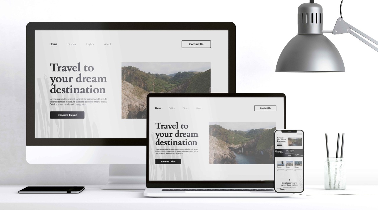
Step 4: Test for Mobile Breakpoints
Here’s where things get a bit technical, but trust us, it’s worth it. Your landing page needs to look good on all screen sizes, not just mobile and desktop. Enter the breakpoint: the width of your page when it switches from one design layout to another.
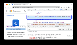
Check your design on multiple devices (phones, tablets, desktops) to ensure your content looks great everywhere. Tools like Google Chrome’s Developer Tools allow you to simulate different screen sizes, so you can tweak your page until it’s perfect for every user.
Step 5: Don’t Forget About Mobile Navigation
On mobile, navigation is crucial. Forget complex menus and endless scrolling. Simplify your navigation to a few key options—ideally just one, like a “Buy Now” or “Sign Up” button. Keep it simple, and make sure it’s always visible and easy to tap.
Sticky headers are also a smart mobile design hack. These headers stay at the top of the screen as users scroll down, keeping your CTA or key message front and center.
Step 6: Test, Test, Test mobile-responsive landing page
The final step in designing a mobile-responsive landing page is testing. Here’s the suspenseful part: You won’t know if your page truly works across all devices until you test it. Don’t skip this step! Run A/B tests, check how fast your page loads, and analyze user interactions. Use tools like Google Mobile-Friendly Test to get instant feedback on your page’s performance.
The Moment of Truth: Your Landing Page is Now Mobile-Responsive!
Congratulations! You’ve now designed a mobile-responsive landing page that’ll work wonders in 2024. Your visitors will experience smooth navigation, clear content, and a CTA that’s just begging to be clicked. Not only will your users be happy, but Google will reward you, too. Mobile responsiveness is a ranking factor, meaning better SEO and more traffic.
The best part? Your conversions will skyrocket. Visitors who can easily navigate your page and take action are far more likely to convert into customers.
So, what are you waiting for? Stop letting poor design ruin your mobile visitors’ experience. It’s time to design a landing page that’s as smooth on mobile as it is on desktop. Get responsive, get results.
If you enjoyed reading this, check out other latest posts on Mobile responsive designs, SSL and tech related.