
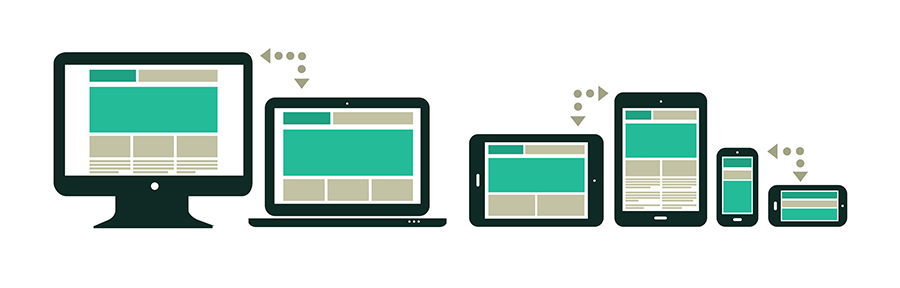
Alright, let’s talk about CSS media queries, the hidden weapon in your web design toolkit. You know the drill: your website looks fantastic on a desktop, but the moment you shrink the screen—BAM—it’s a jumbled mess. Images are squished, buttons are tiny, and everything’s out of whack. Yikes.
In 2024, mobile-first design isn’t just a trend; it’s non-negotiable. But don’t worry, this isn’t about making sacrifices—it’s about unlocking the power of CSS media queries to ensure your site looks perfect, no matter the screen size. Curious? Well, buckle up, because you’re about to become a mobile design wizard.
Further readings: Mobile Responsiveness in E-Commerce: The Benefit and the Role it plays
What Are CSS Media Queries? (Prepare for a Design Revolution)
In the simplest terms, CSS media queries are like your website’s personal stylist, changing how your site looks based on the device being used. The magic lies in using different styles for different screen sizes—so your website adapts to the device it’s being viewed on. This means no more awkward zooming or squinting on mobile devices.
In short: CSS media queries help you create a mobile-friendly design that adjusts to any screen size.
Step 1: The Basics of CSS Media Queries
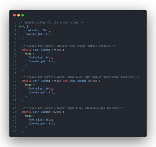
A CSS media query checks the viewport (the visible area of the web page) and applies specific styles based on the width of the device’s screen. You can target specific devices like phones, tablets, or desktops, and adjust your layout accordingly.
Here’s a basic example:
css
Copy code
@media (max-width: 768px) {
body {
background-color: lightblue;
}
}
In this example, when the screen width is 768px or less, the background color of the page will change to light-blue. Simple, right? But this is just the tip of the iceberg. Media queries allow you to do much more than change background colors. You can adjust fonts, layout, images, and even hide elements that don’t make sense on mobile.
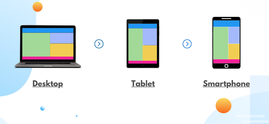
Step 2: Designing for Different Devices
Now that you understand the basics, let’s apply media queries to create a mobile-friendly layout. The first rule of thumb is to design for the smallest screen first—this is known as mobile-first design.
Here’s how it works:
- Set default styles for desktop (the largest screens).
- Add media queries to adjust styles for smaller screens (tablets, phones).
Here’s an example of a mobile-first approach:
css
Copy code
/* Default styles for desktops */
body {
font-size: 18px;
background-color: white;
}
/* Tablet styles: max-width 1024px */
@media (max-width: 1024px) {
body {
font-size: 16px;
background-color: lightgray;
}
}/* Mobile styles: max-width 768px */
@media (max-width: 768px) {
body {
font-size: 14px;
background-color: lightblue;
}
}
Notice how the default (desktop) style is applied first, and then each media query steps in for different screen sizes. For tablets, we shrink the font and change the background to a softer color. For mobile, we adjust the font size again and make the background even lighter. Simple but effective.
Step 3: Optimizing Images with Media Queries
Here’s where the fun begins. Images can be a pain on mobile devices if they aren’t optimized. But with media queries, you can ensure your images always look their best, no matter the screen size.
Use max-width in your media query to scale images down for smaller devices:
css
Copy code
img {
width: 100%; /* Ensure image scales responsively */
height: auto;
}
@media (max-width: 768px) {
img {
max-width: 90%; /* Reduce image size on mobile */
}
}
This ensures that images are responsive and won’t overflow on smaller screens. They scale down perfectly and look crisp—no matter the device.
Step 4: Hiding Elements on Mobile (The Magic Trick)
Not everything on your desktop website needs to be on mobile. Sometimes, less is more. You can use media queries to hide elements on smaller screens. Maybe that huge sidebar isn’t necessary for mobile users, or you can remove a big hero image to save space. Here’s how you do it:
css
Copy code
/* Hide sidebar on mobile */
@media (max-width: 768px) {
.sidebar {
display: none;
}
}
This simple media query hides the sidebar on screens 768px or smaller. You can do the same with any other element you don’t want cluttering up mobile devices.
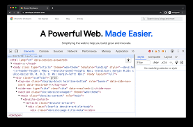
Step 5: Test Your Design (The Suspenseful Part) for CSS Queries
Here’s where the tension rises—will it work? You’ve crafted your media queries, adjusted your images, and hidden unnecessary elements. But now you have to test your design across different devices to make sure everything looks amazing.
Use tools like Chrome DevTools or BrowserStack to simulate various screen sizes and check your layout. Adjust as needed, and don’t be afraid to experiment. After all, great design takes time.
Create Your Website, Blog, Or E-Commerce Site In 5 Minutes
The Final Reveal: Your Mobile-Friendly Masterpiece
Congratulations! You’ve just unlocked the power of CSS media queries, transforming your website into a mobile-friendly marvel. Your visitors will now enjoy a seamless experience, whether they’re on a desktop, tablet, or phone. And you? You’ll get the satisfaction of knowing your design is top-notch for every device in 2024.
So, are you ready to optimize your site and make it mobile-responsive? Use these tips, play around with some media queries, and get ready to see your website transform into a smooth, stylish, and perfectly optimized mobile experience.
Go ahead—test it out! Your mobile users will thank you.
If you enjoyed reading this, check out other latest posts on Mobile responsive designs, SSL and tech related.